
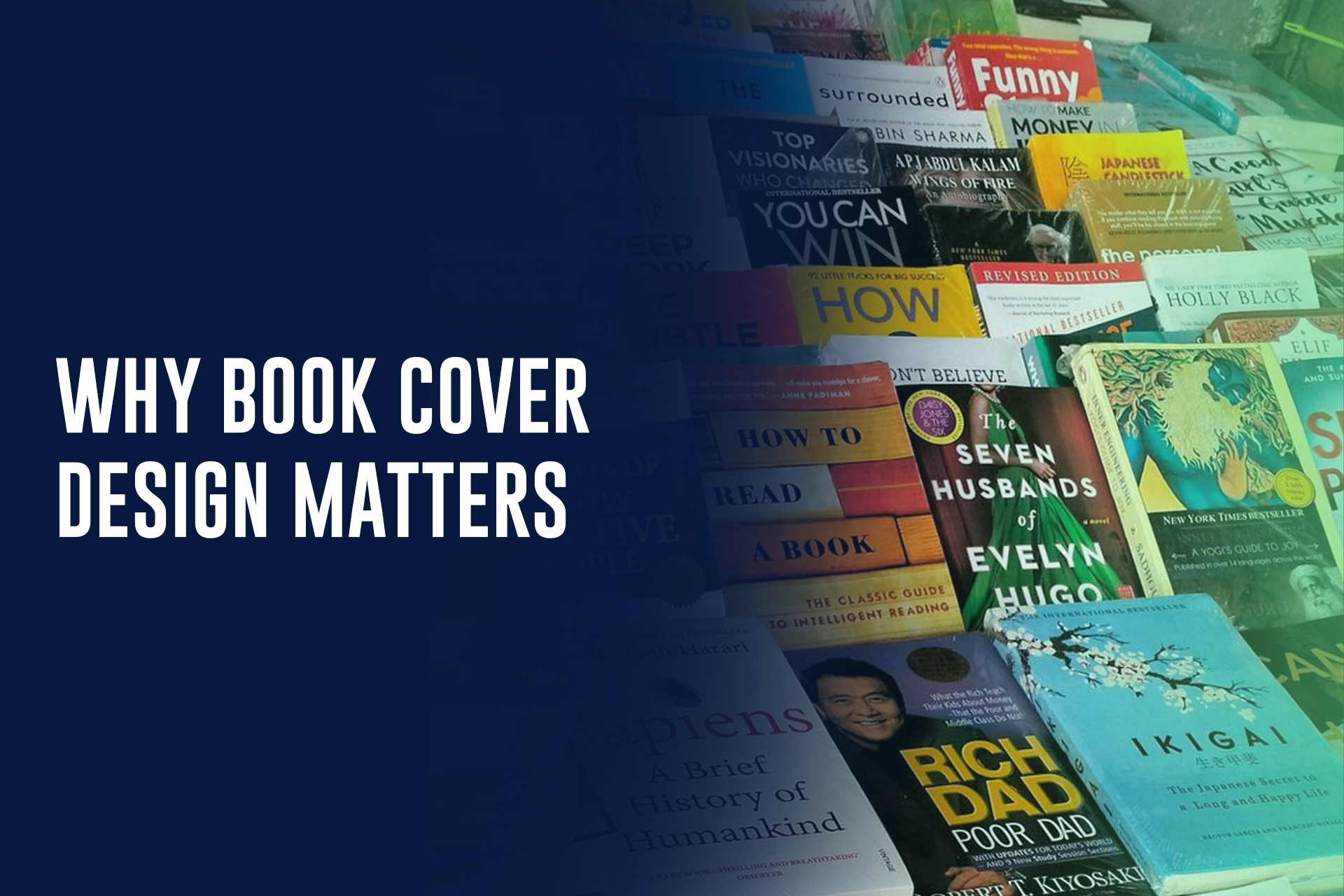
Most readers meet your book as a thumbnail — a couple hundred pixels wide on a phone screen, scrolling past dozens of other covers in a search results page. Your cover has less than a second to communicate what your book is and convince someone it’s worth a second look. That’s a lot of pressure for one image, which is exactly why it deserves real attention.
A Cover’s Real Job Is to Sell at Thumbnail Size
A cover that looks striking as a full-page print but turns to mush at 150 pixels wide isn’t doing its job, because that’s the size most readers actually encounter it in first. Bold typography, a clear focal point, and strong contrast matter more than intricate detail — anything too fine gets lost the moment the image shrinks.
What a Cover Signals Instantly
Before a reader registers your title, they register genre — and they do it through visual conventions that have built up over years of readers’ expectations. A certain font style, color palette, and imagery says “thriller” before anyone reads a word; a different combination says “cozy romance” or “business book.” Straying too far from your genre’s conventions doesn’t read as originality to browsing readers — it often just reads as “not what I’m looking for,” and they scroll past.
Common Mistakes That Undercut Great Books
The most frequent issues are self-inflicted: too many competing elements fighting for attention, title text that’s illegible at small sizes, imagery that doesn’t match genre expectations, and an overall look that reads as amateur next to professionally designed comp titles on the same shelf. A strong manuscript with a weak cover routinely gets passed over by readers who never even open the sample.
What to Hand Your Designer
The best covers usually start with a clear brief, not a blank page. Give your designer three to five comp titles — successful books in your genre whose covers you admire — along with your back-cover blurb, a sense of tone (dark and moody, bright and playful, minimal and literary), and any hard must-haves. The more direction you provide up front, the less back-and-forth it takes to land on a cover that actually sells.
A cover is a marketing asset as much as it is art. If you’d like to see what that looks like for your book, we’d love to talk through a design brief with you.
